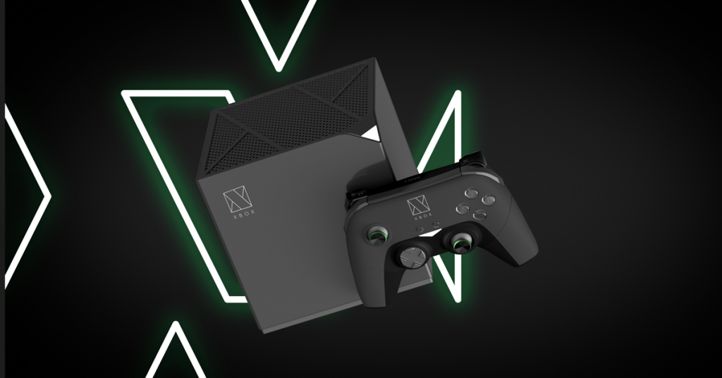
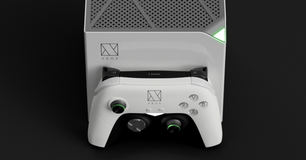
Redesigning The Xbox Series X Gaming Console
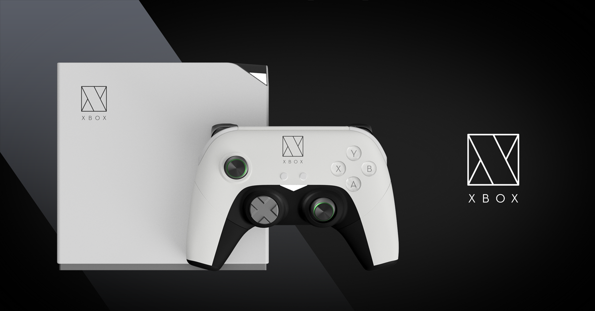
With the launch of the Xbox Series X and SX microsoft ushers in an upgrade to their current gen system the Xbox one X and Xbox one S. We quite liked the minimal look of the new systems but thought we would take a stab at how we would potentially improve the design. One thing we had always wondered is why the XBOX was not simply a box? The current design does take a step in this direction but we felt like we would go all the way and make the console’s form factor a box similar to Nintendo’s classic Gamecube design. The almost monolithic aesthetic is simple and to the point but far from boring.
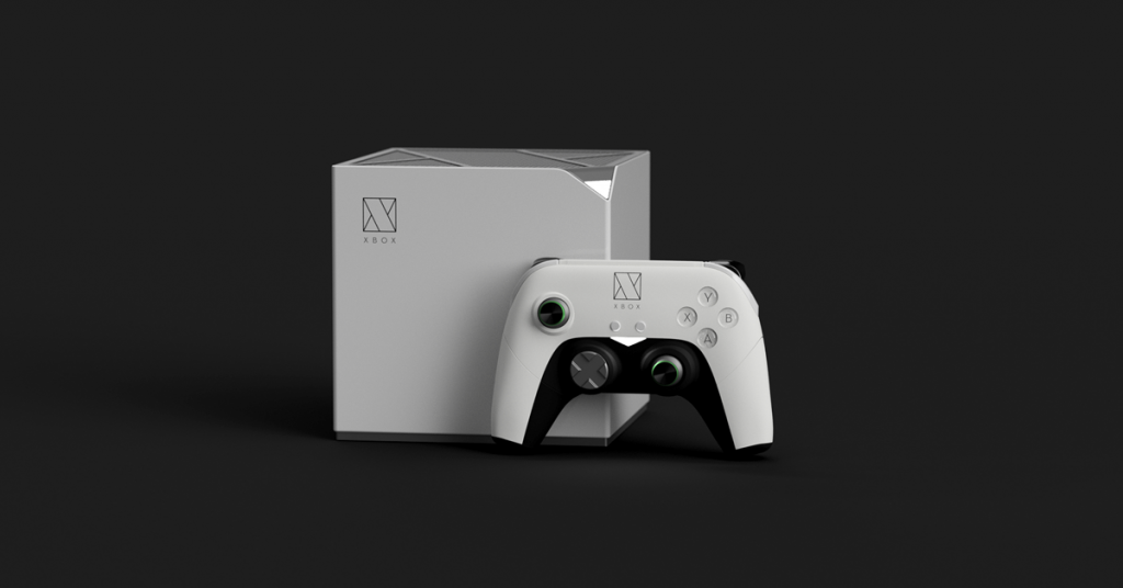
We decided to carry the “Box” theme throughout the branding as well giving xbox a new logo that perfectly represents the products name and looks great in glowing neon green. The design is simple and clean, translating well to the air vents on top of the console. A chipped corner acts as a power button as well as a power on indicator light and once again reinforces the shard-like pieces that come together to form the logo.
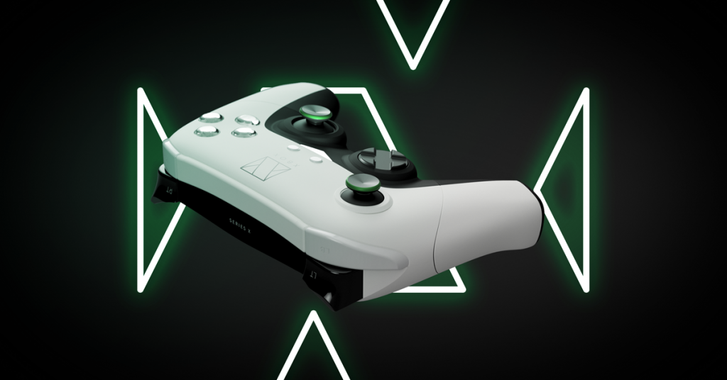
Since Xbox 360, the Xbox’s controller has been known as the leading controller design across consoles. The stick placement, triggers and ergonomic feel that just molds to your hands so well has made it the controller to beat. It’s no wonder ever since this design there have been very few improvements made but for the most part the controller has stayed the same. We wanted to keep a lot of what people are used to about the controller in tack with our concept but change it enough so that it really felt like a new product. There needed to be just enough of a new look and feel to keep the look fresh while not getting rid of the components that gamers grew to love.