Top Four Packaging Designs Of The Month
This month, Imagemme decided to start a series that highlights and celebrates the top four packaging designs we saw during the month. We would like to use our platform to extend recognition to all of our colleagues in the package design industry who continue to push the envelope for us as creatives.
Figlia Feminen By Nature
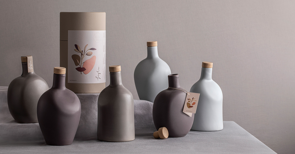
Superunion Agency’s creation of Figlias Olive oil is ground-breaking, presenting us with unique forms and textures that transport us to a different time. Figlia, which means daughter in Italian, was founded to celebrate the transfer of a family farm from grandfather to the now CEO granddaughter, Emanuela Dargenio. Superunion set out to create packaging that celebrated “feminine individuality”. The packaging, made entirely out of ceramics, was sculpted to represent “soft organic shapes” like foliage and fruit. The design is reminiscent of an older time through its artful execution of a seemingly underdeveloped form. The shape and color palette of the packaging shares a rustic vibe that subtly references the earthiness of the farm for which it was developed.
Legend Of The White Snake
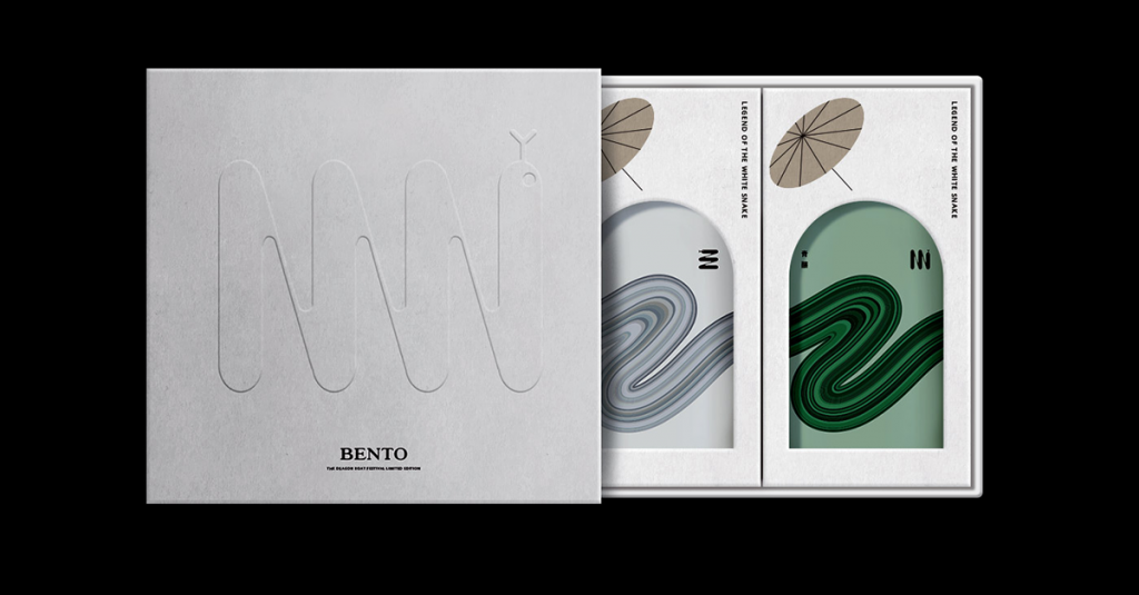
Inspired by an old Chinese love story, Legend of the White Snake took our breath away. The combination of contemporary design with an antiquated theme helps to produce some truly masterful packaging design. The primary packaging hero image swirls across the face of the bottle like a serpent, while the cap of the bottle itself sports a snake-tongued tag. The minimal adornment and arrangement of copy are nods to the design’s origin in China. The subtle application of mute colorways and Matte texture somehow give the packaging a funky futuristic feel. Joined by neat secondary packaging, the bottle fits into an insert that slides in and out to reveal the face of the bottle.
 Barcelona Chocolate Museums “Bean To Bar” Packaging
The Barcelona Chocolate Museums new packaging for their “Bean to Bar” brand is easily some of the best packaging we have seen this month. The color palette is a direct reference to the rawness of the chocolate itself. Zoo Studios, the creative agency behind this success created a booklet-like packaging that transcribes the process of how the chocolate was made. The package gives off an earthy feel through its natural color palettes and old-timey adornments, like the twine that holds it together; it almost looks like a vintage train ticket or boarding pass.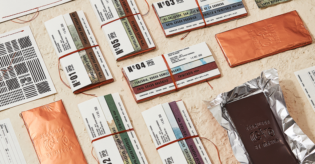
Igloo Package update
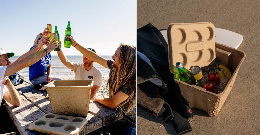
Last but certainly not least, our favorite package design of the month comes from Igloo. The powerhouse brand Igloo, a name synonymous with Styrofoam and plastic has just created the world’s first eco-friendly cooler. While the focus of this list has been aesthetics, we would like to take a moment to highlight a sustainable design. Igloos’s “Recool” is the first cooler ever created entirely from biodegradable materials. The design’s function and durability shine through, even though its packaging is not the prettiest. The small cooler is strong enough to hold up to 75 lbs. The rough pulp aesthetic is fitting and is tailored to this sustainable design perfectly.

Photos sourced from The Dieline


