Reimagining The Starbucks Carafe
The integration of aesthetics and functional capability are what propel design forward. Beyond a fresh new look, society craves advancement in the form of function that simplifies daily life. User experiences crafted by designers in an effort to make the experience a fluid and enjoyable one, are sometimes so seamlessly ingrained into a product that the user may overlook these subtle additions.
Lately, our team has been thinking of ways to enhance everyday items and involvements. From waiting in line to taking a deeper look into how we wash our hands or brush our teeth. Our creative director, noted coffee lover, decided to take a stab at enhancing an
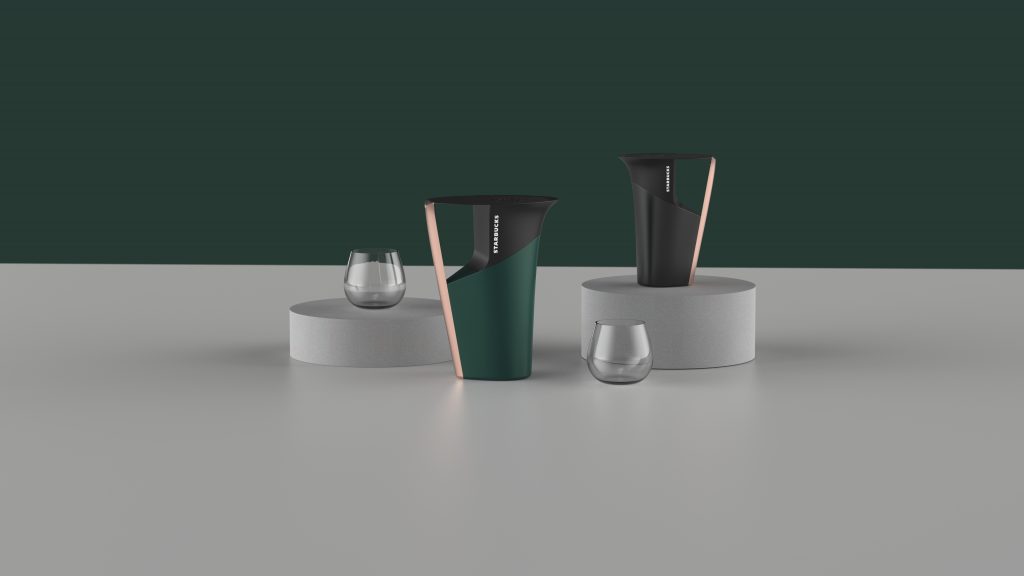
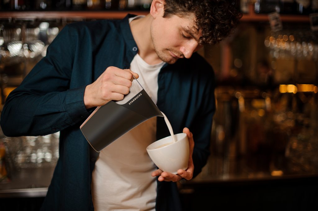
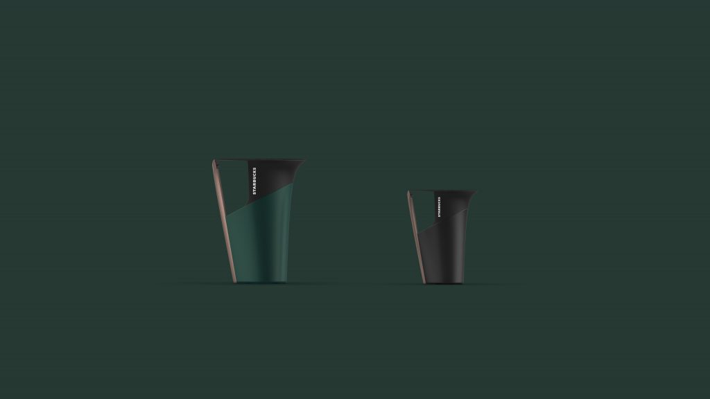
His approach to the Starbucks carafe has completely revitalized and re-envisioned its initial approach. A carafe, usually an open-topped pitcher made of glass to pour water or milk has been reimagined to produce an all-new look and feel! Using his concept as an opportunity to reinforce the stylish look and feel of the store into the carafe design itself; he artfully implemented the brand logo into the carafe to reinforce brand recognition. The top of the Carafe, which keeps debris from falling in, features an emboldened Starbucks logo.
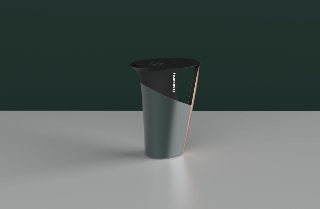
The form of the


