Revisiting the Logo
“Logo Fatigue” has hit the Chinese luxury market, according to recent reports, which has some brands on edge, and rightly so: the top two percent of the Chinese population accounts for a third of the world’s luxury sales. As China goes, so goes the world.
Case in point: just last March, Louis Vuitton shocked attendees of their Paris show – not with pyrotechnics, but with a subtle absence. The brand’s trademark logo and “Damier” canvas weren’t featured anywhere on the catwalk. We don’t believe it’s entirely coincidental that the brand generates 28% of its sales in China.
![]()
LV, which had reported slow growth revenue the previous two quarters, was essentially heralding a new aesthetic – one that appeals to a more discerning, savvy customer, who’s given up equating a high-price point with luxury.
What’s in a name? Or a logo, for that matter? Status, of course, or that’s been the case until recently. If other big-name brands go the route of LV and distance themselves from increasingly antiquated trends – or reinvent their image on the whole – what will the market begin to look like? It’s fun to imagine.
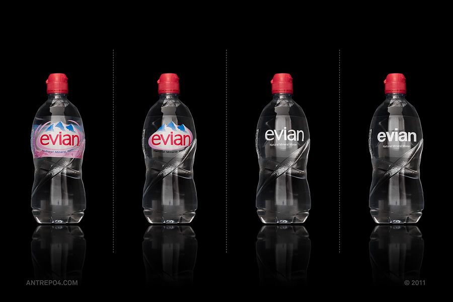
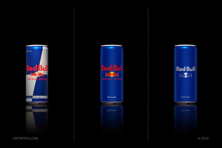
Antrepo, a multi-disciplinary consultancy based in Japan, generated these gradients in minimalist design as an exercise. Is this how the market would look if “Logo Fatigue” were to spread virally?