What does pain relief really look like?
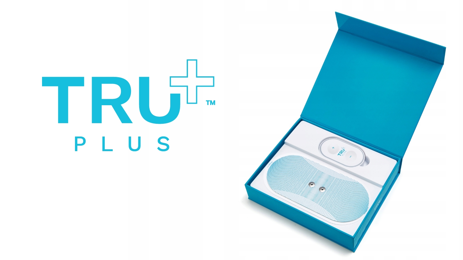
Tru+
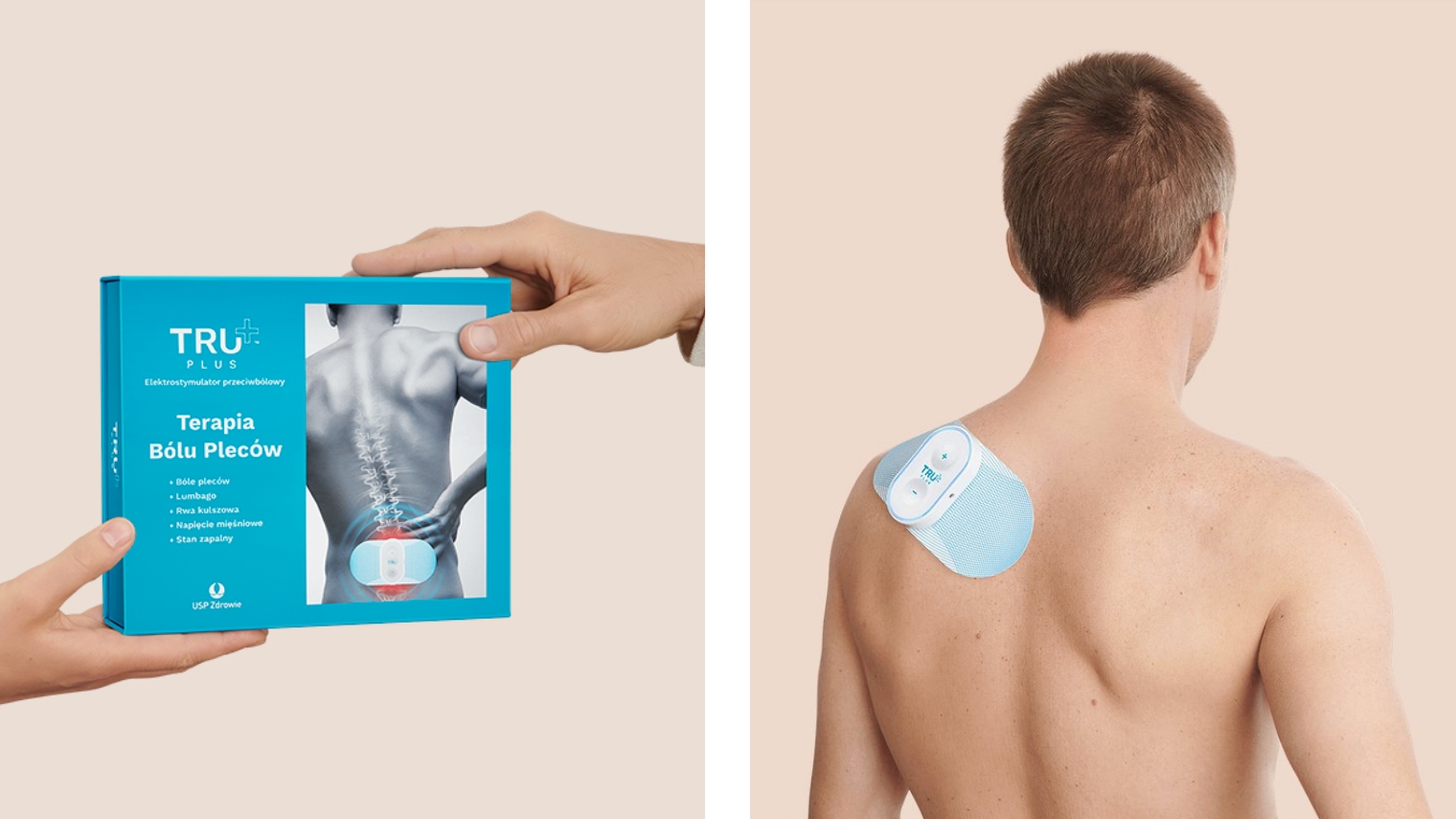
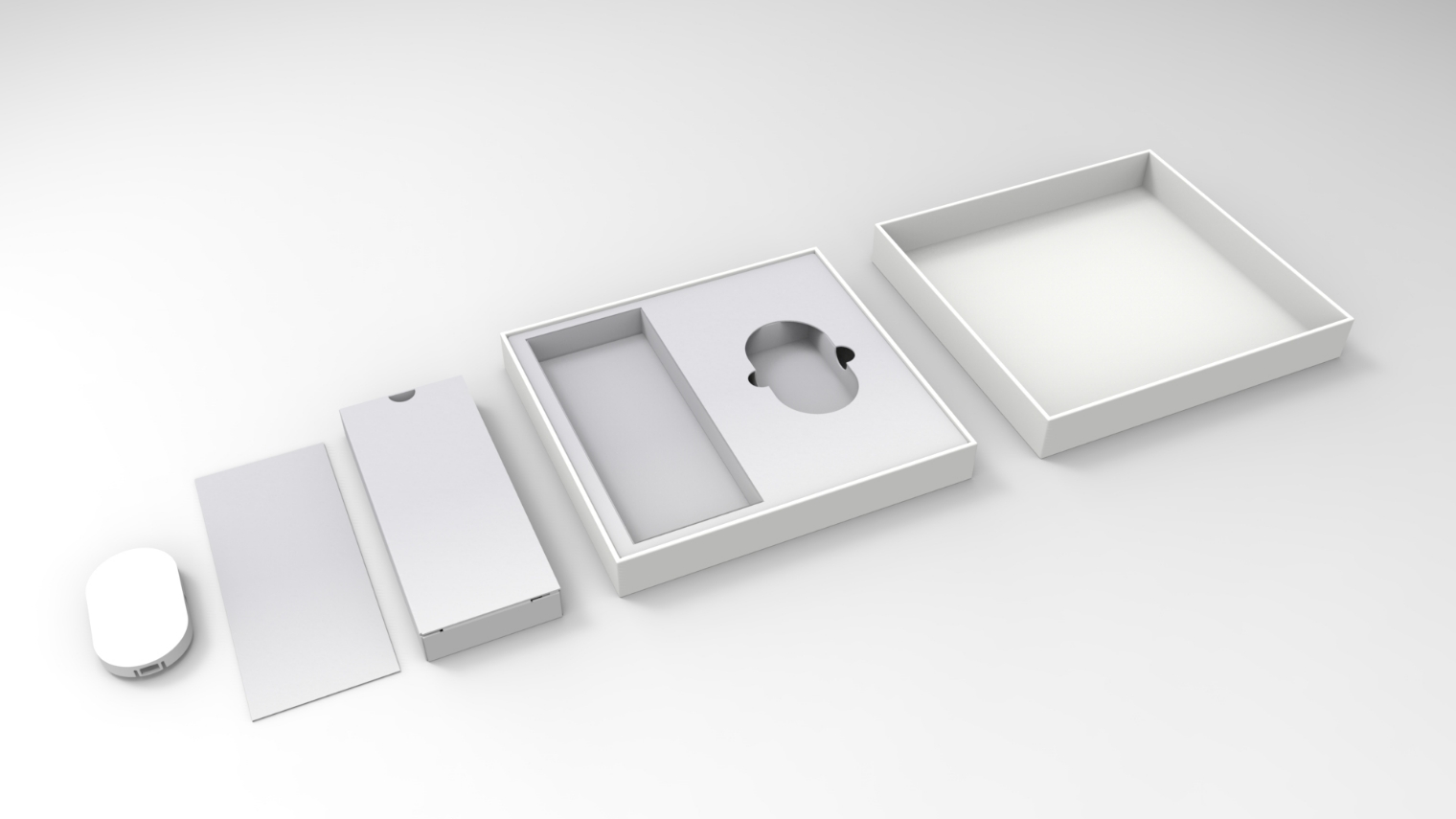
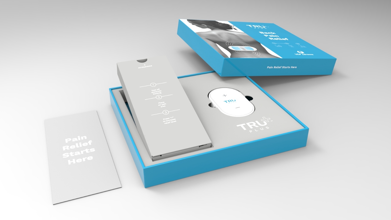
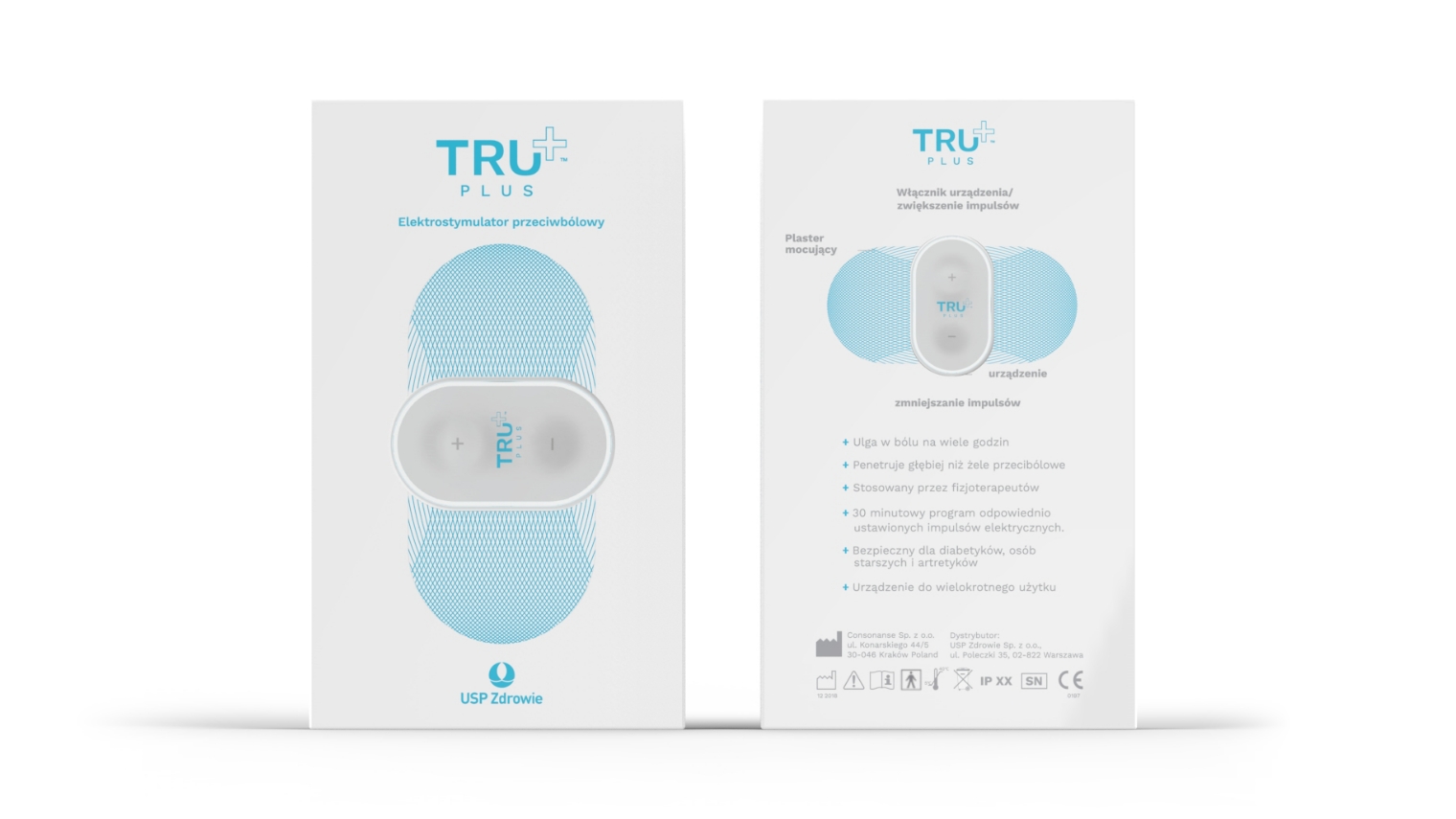
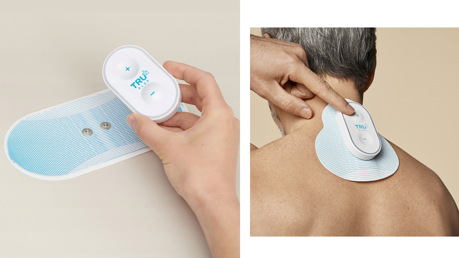
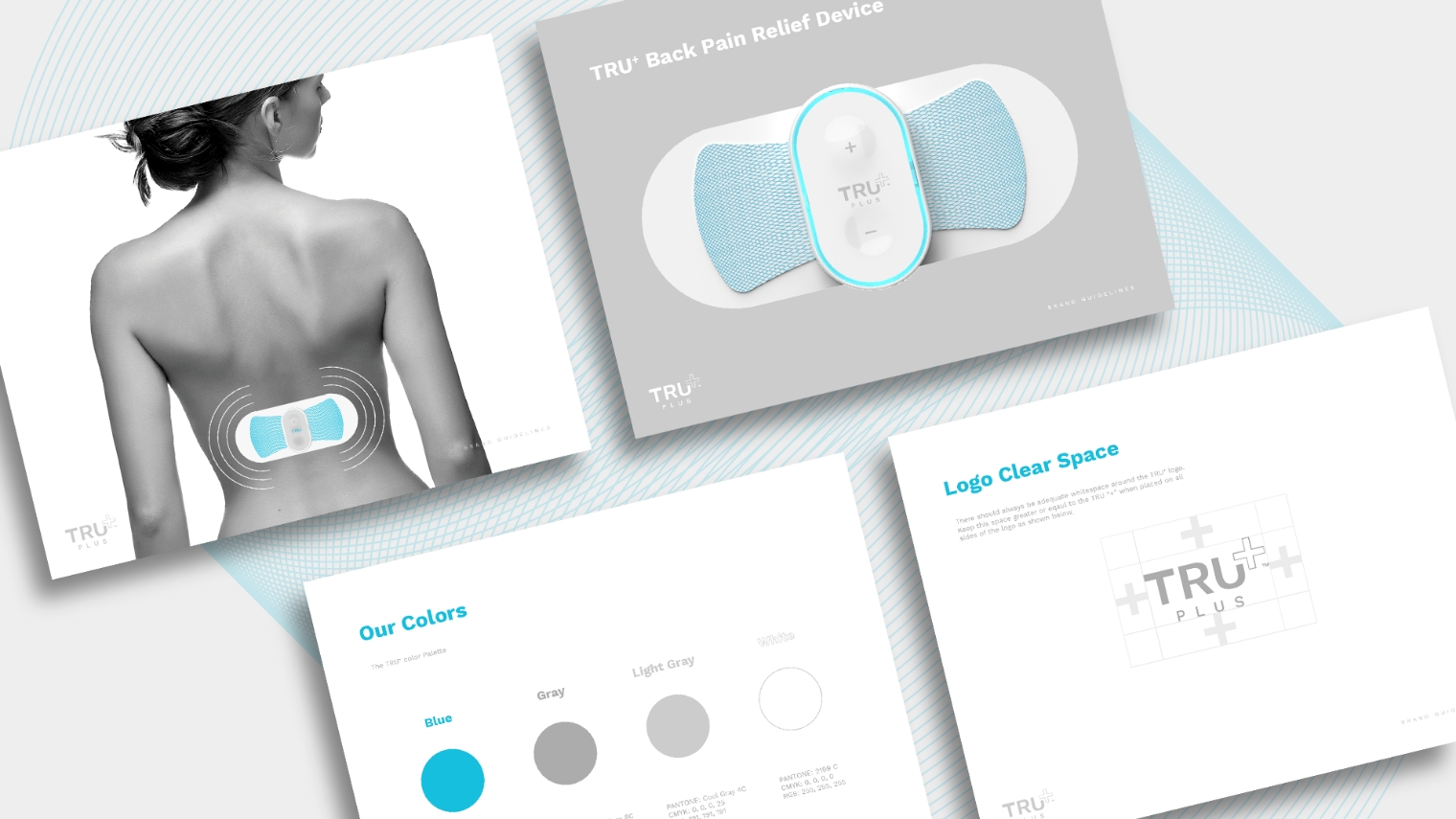
A polish pharmaceutical company wanted to launch a new TENS (transcutaneous nerve stimulation) device for drug free pain relief. We started by creating their identity before moving onto refining the product design and creating a well organized packaging experience. The blue color gave the brand a calm almost cooling feel which helped speak to the pain relief the product provided. Our team developed a pattern that could be used across marketing materials and as a prevalent branded element on the devices replaceable electrode pads.
Want to learn more?LET'S TALK