Natural American Spirits Re-Package US Tobacco
Natural American Spirits did such a clever branding job that they acquired their very own, court-mandated disclaimer: “No additives does NOT mean a safer cigarette”.
Nevertheless, the conscious or unconscious perception that Natural American Spirits are healthier than other cigarettes has persisted, and driven the brand’s steady rise in popularity. This is due as much to their packaging design as anything else.
Traditionally, cigarettes were branded to be cool, sexy, and sophisticated.
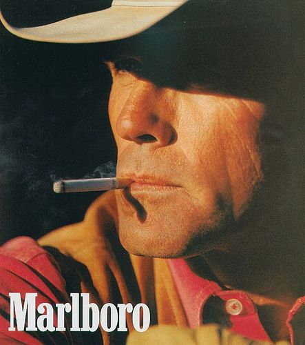
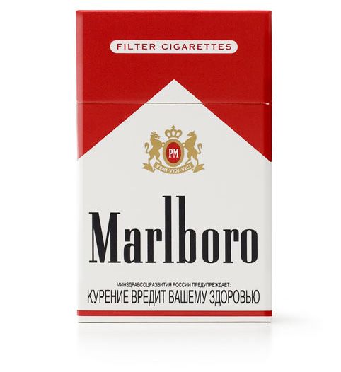
When it comes to packaging, this meant aggressive, bold colors, like the iconic Marlboro red:
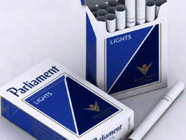
Or the royal and darker blues of Parliament:
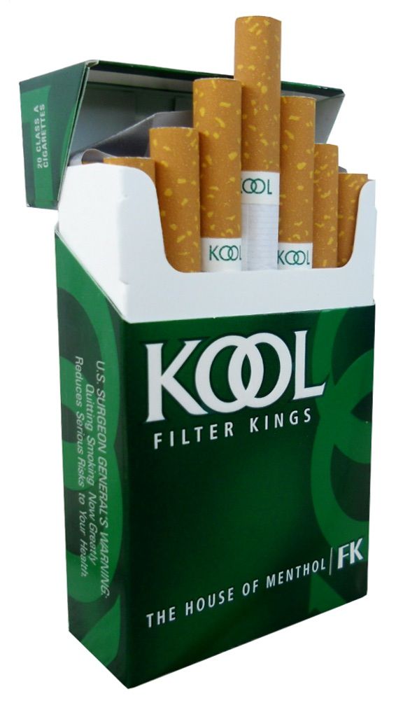
Or the deeper, shaper greens of Kool:
The branding goal for Natural American Spirits wasn’t to be edgy or adventurous, but exactly the opposite: to be safe. Developing a comparatively safer image meant using safer, softer, lighter colors.
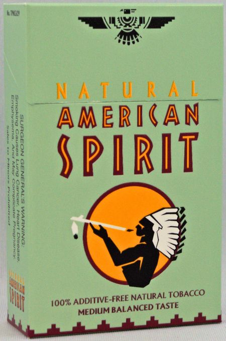
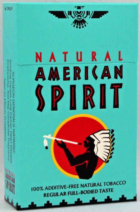
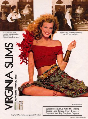
Lighter shades like these were traditionally used, if at all, for cigarettes being marketed specifically toward women. Natural American Spirits, however, has been using them to reach men as much as women.
These lighter, softer, and generally more welcoming colors reflect their consumers’ desire/fantasy to find a special place where they can smoke without recourse, which has displaced, to some extent, the desire to look cool or refined, as the motivating force to pick up a pack.
Of course, the catch is that now Natural American Spirits have themselves become cool, so the original strategy – to move away from a refined persona to one presenting itself as a healthy alternative – has now provided the company the added benefit of hip cache.