America’s Top 10 Tech-Savviest Cities – How Do Their Websites Compare?
According to TravelAndLeisure.com the 10 cities below are America’s Tech-Savviest. But are their tourist websites up to par?
Dhanesh Shelat investigates…
1. SEATTLE
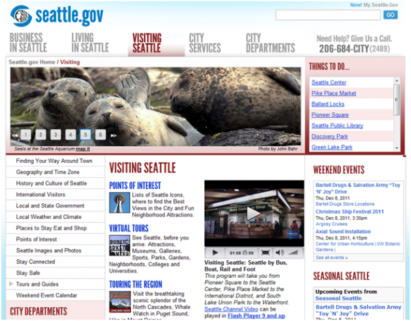
Thumbs Up:
- Content is useful, and there is plenty of it
Thumbs Down:
- Too much content on one page to take in
- No links to social media channels
- Outdated look to the website
OVERALL: THUMBS DOWN
2. SAN FRANCISCO
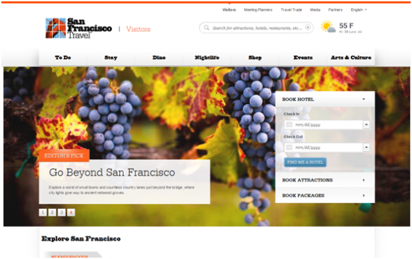
Thumbs Up:
- Clean, simple visually-appealing aesthetics and captivating design that allude to San Francisco as a cultural capitol
- Easy-to-navigate menu
- Meta-tags appear to be keyword-optimized
Thumbs Down:
- Page speed of 79/100 is a little off the generally accepted minimum score of 80/100
OVERALL: THUMBS UP
3. AUSTIN
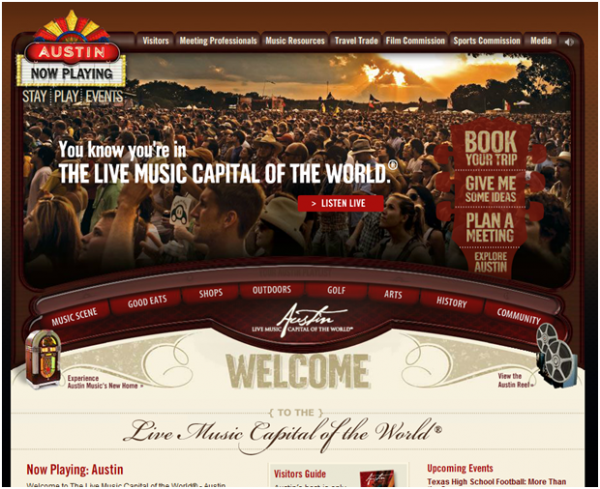
Thumbs Up:
- Design captures the personality of the city and its music heritage
- Interactive with great visuals and sound
Thumbs Down:
- Entire site made in flash which makes it difficult for the search engines to index
- Slow load speed, again due to major flash use
OVERALL: THUMBS DOWN (ONLY BECAUSE THE SITE IS ALMOST EXCLUSIVELY CREATED IN FLASH)
4. PORTLAND, OR

Thumbs Up:
- The navigation bar contains the major pages that tourists would be looking for when visiting a city
Thumbs Down:
- The design lacks personality when compared with Austin and San Francisco. The site well designed in terms of structure, but the visuals could be cranked up a notch to dazzle consumers and keep them on the page.
- Page seems a little text heavy, lacking focus on where you want the user’s attention to go
OVERALL: THUMBS DOWN
5. BOSTON
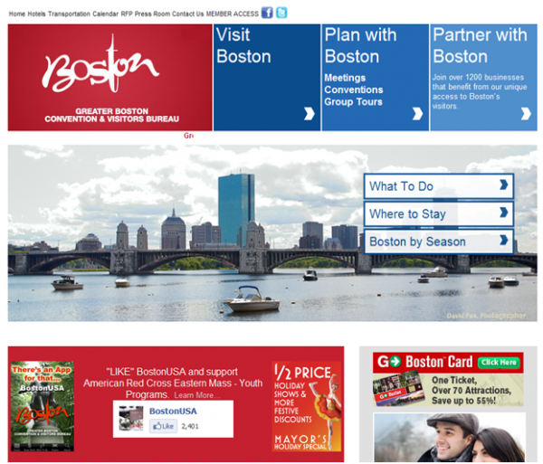
Thumbs Up:
- There is a focus on deals as well as historical and tourist information
- Title Meta Tag appears to have been keyword optimized
Thumbs Down:
- The site seems less bi-partisan than the other cities as there is a heavy emphasis on advertising. This can create a credibility issue.
- The design is slightly outdated with its heavy reliance on boxes
- Use of many different fonts appears to break the design and appear text heavy
OVERALL: THUMBS DOWN
6. SAN DIEGO
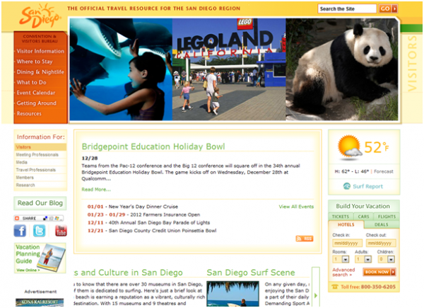
Thumbs Up:
- Colorful and youthful design appeals to families
- Title Meta Tag appears to have been keyword optimized
Thumbs Down:
- Loading time is very slow. It has a Page Speed score of 67/100, which is poor. Generally Websites should aim to have a Page Speed score of at least 80/100.
- The design is outdated
- The left navigation is not use friendly and hides many of the sites useful pages
OVERALL: THUMBS DOWN
7. NEW YORK
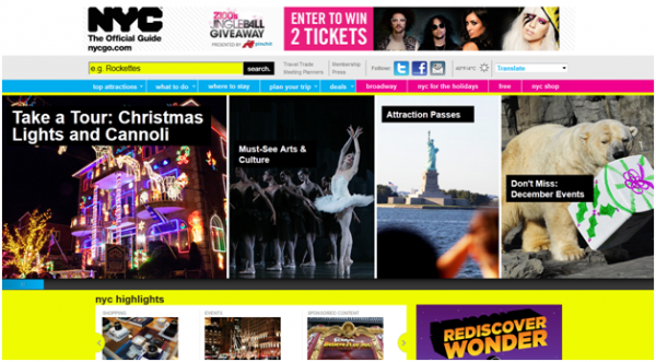
Thumbs Up:
- Language selector (with huge selection of language options) is useful for visitors whose native language is not English
- Vibrant and energetic design is in keeping with New York’s personality
- Design and offering is appealing to many cohorts
- Meta tags appear to have been keyword optimized
- Navigation menu links to main subpages that new visitors to the city would find useful
Thumbs Down:
- Page speed of 78/100 is a little off the generally accepted minimum score of 80/100
OVERALL: THUMBS UP
8. WASHINGTON, D.C.
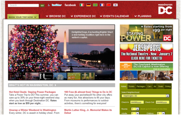
Thumbs Up:
- Main banners show the city’s most popular attractions
- Has links to website’s very popular and active social media channels
- Offers free downloadable Visitor’s Guide
Thumbs Down:
- Meta title tag doesn’t appear to be keyword optimized
- Overall design them is outdated
- Link to free downloadable Visitor’s Guide is at the bottom of the page
- Website loading time is extremely slow, this represented by the homepage’s Page Speed of 55/100.
OVERALL: THUMBS DOWN
9. SAN JUAN, P.R.
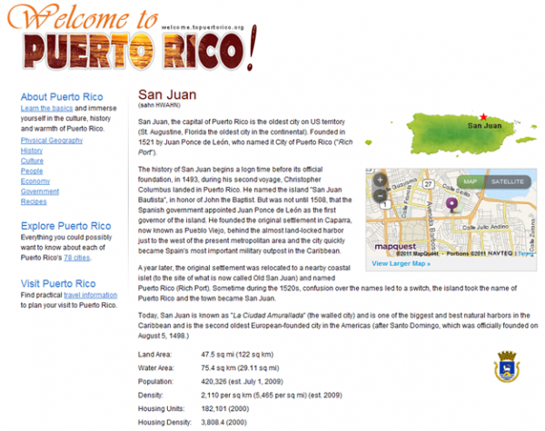
Thumbs Up:
- An abundance of useful text content
Thumbs Down:
- Bland theme, just a large article of text with a few photographs. An island that calls itself “the island of enchantment” should show us why!
- No link anchors to easily navigate the long page
- Page Speed of 65/100, very poor considering the visual simplicity of the site
OVERALL: THUMBS DOWN
10. MINNEAPOLIS/ST. PAUL
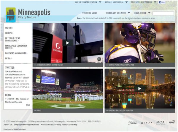
Thumbs Up:
- Modern and clean site design
- Twitter updates on the side panel
- Relatively fast loading site loading time, Page Speed of 88/100 is good.
Thumbs Down:
- Meta tags don’t appear to be keyword optimized.
- Color and size of font makes it difficult to read.