- Brand Naming + Identity
- Packaging Design
- Website Design
A Toothpaste Worth Getting
Out of Bed For
A minty Twist
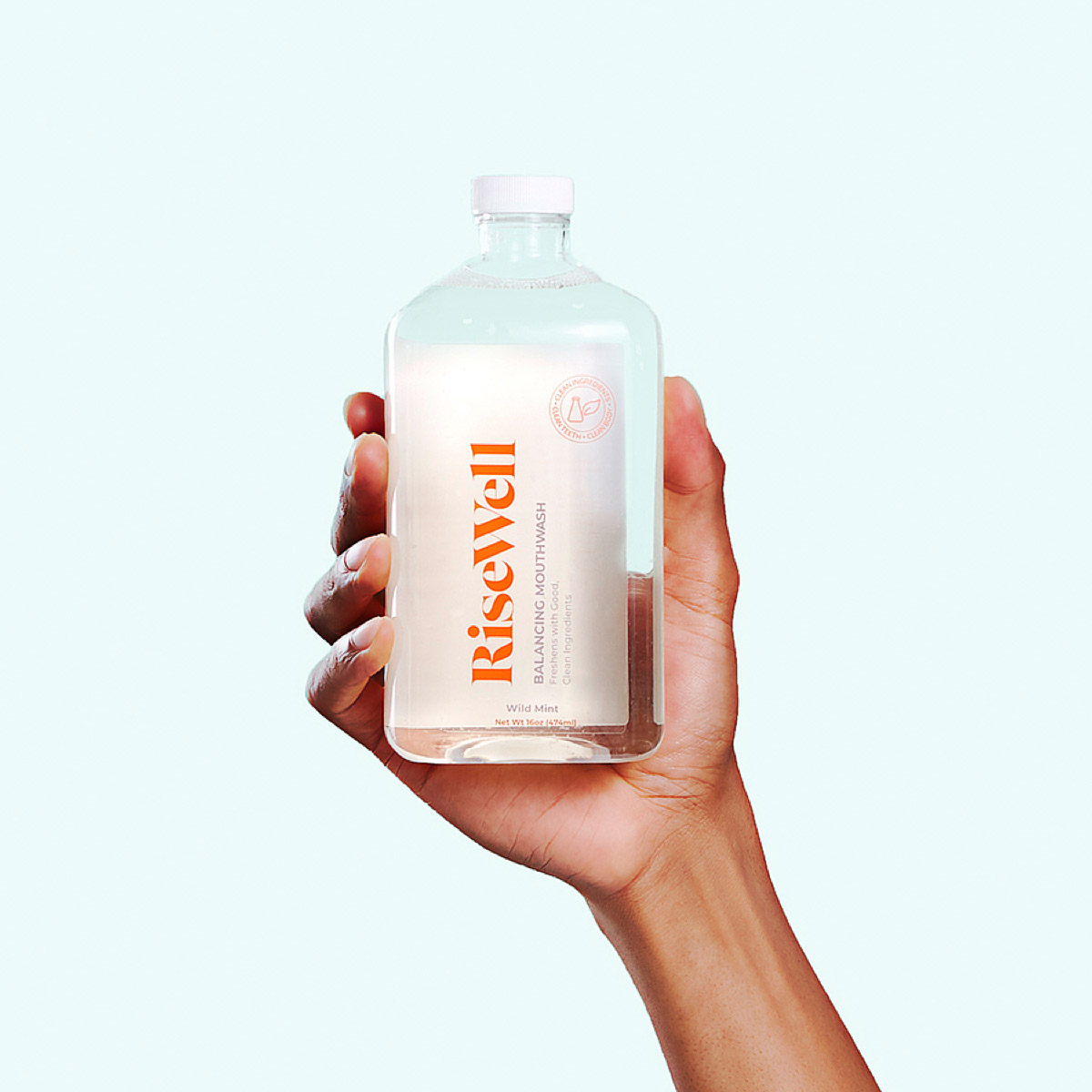
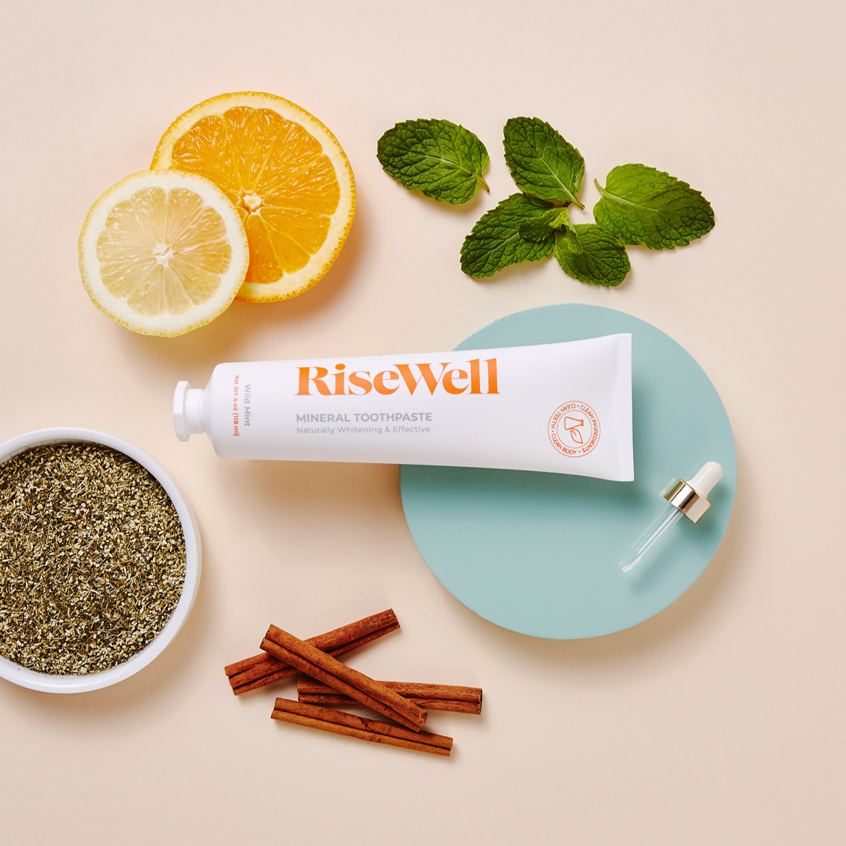
Risewell, founded by soon to be parents and a dentist friend of theirs; set out to create a premium natural oral care line.The trio wanted their products to be just as safe as they were effective.The toothpaste used a unique ingredient not widely used in the United States at the time, Hydroxyapatite, which rebuilds and strengthens tooth enamel naturally.The company approached Imagemme to help shape their brand identity, packaging, and web prescence.
“Risewell’s mouthwash,
toothpaste, and floss
make the mundane
feel that much more
exciting”
– Town + Country
Waking Up
The Industry
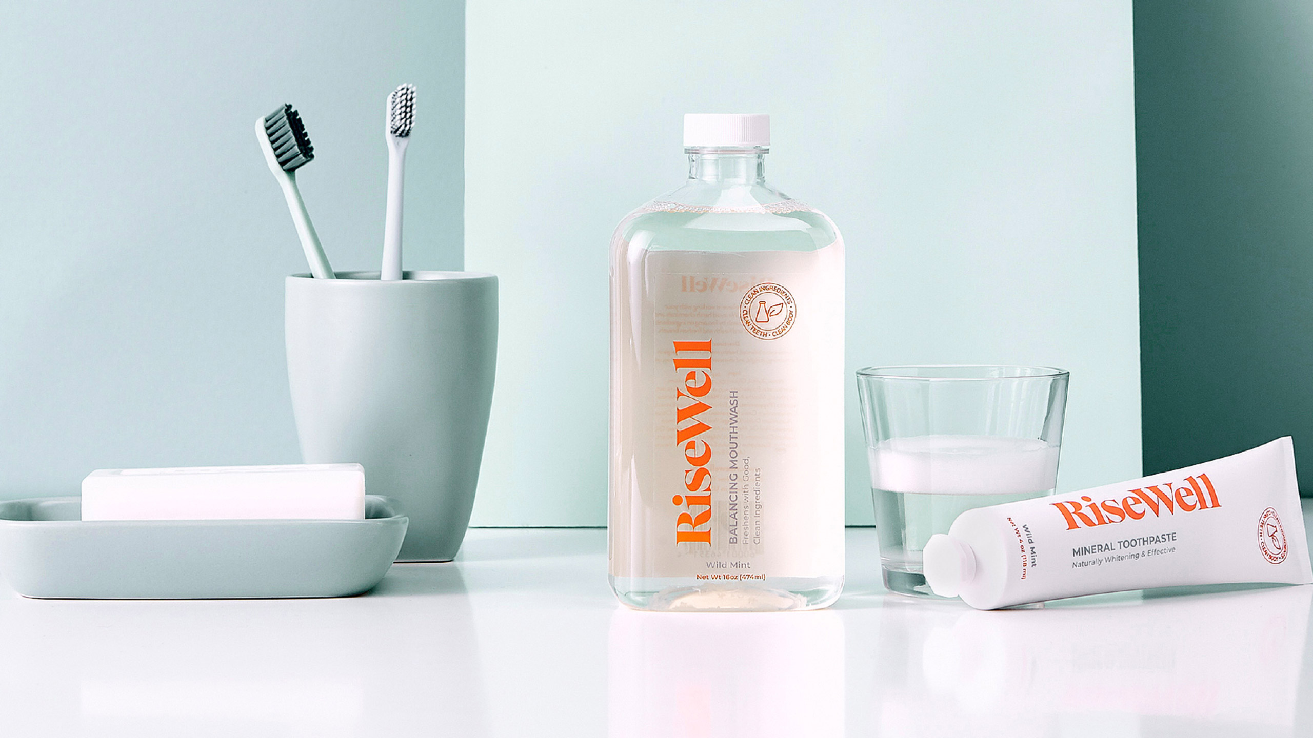
We wanted to wake a sleepy category and create packaging that people could feel great buying, using and displaying. Rather than just focus on oral care as an evening activity we drew inspiration from the warmth of the morning sun which takes on a different tone to other products on the market that rely heavily on cooler sterile conventions.


Going Beyond Just The Name
Taking our cues from the morning sun we arrived at the name “RiseWell”. Displayed prominently in a vibrant orange, the word mark is highly visible across the entire brand identity. The warmth and energy the name and color convey were then used to create a rich online store for first time customers to learn more about the innovative toothpaste brand and its ingredients.

Expanding The Product Line
After the successful launch of the mineral toothpaste and balancing mouthwash, RiseWell retained us to flesh out their product line. We designed a kid friendly toothpaste, complete with a fun illustrated character as well as expanded the main line to include floss, a toothbrush, and an e commerce bundle.
