- Product UX/UI Design
- Front End App Design
Reinventing A Classic
For a New Generation
What’s Old is New
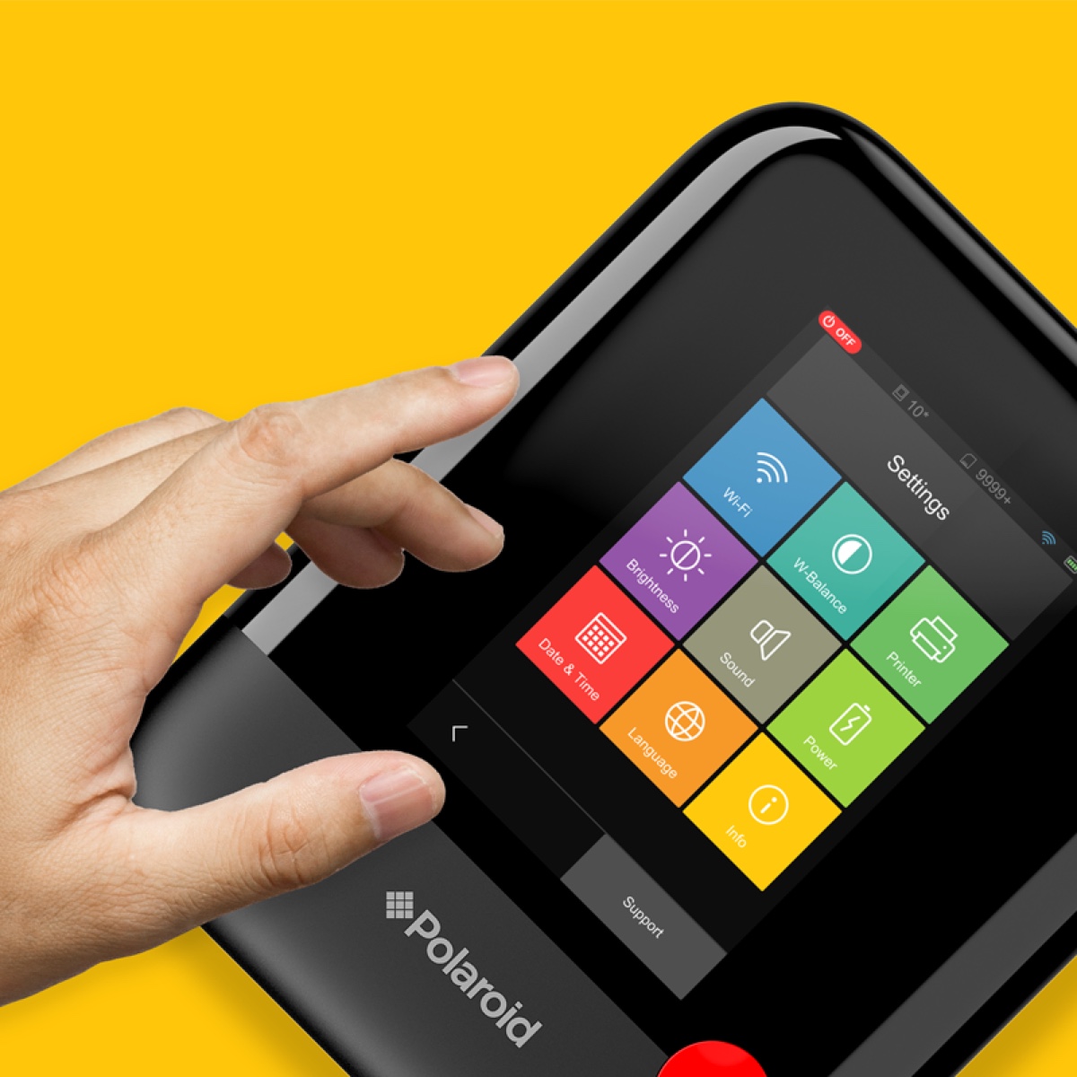
Polaroid, a household name that’s been reinventing itself for a younger audience, approached us to draft and design an interface for the Polaroid POP, the newest entry in their camera line. After an audit of the previous generation’s camera, we mapped and prototyped different onscreen navigation systems to streamline and augment the user experience.
The latest digital
camera from Polaroid
blends cool design
with a better designed
camera experience”
– CNET
Prints at
Your Fingertips
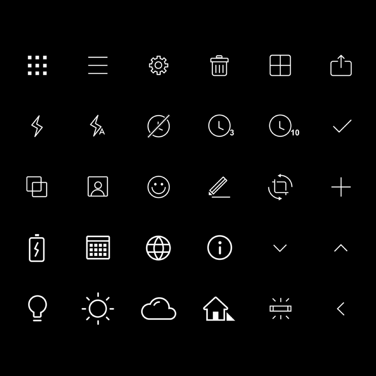
We settled on an interface styled for a broad user base — both tots and their parents — that kept navigational buttons large and simple, while menus used a grid system and clear iconographic language to make snapping a photo, placing an emoji, and printing a breeze.


An Experience That Surprises and Delights
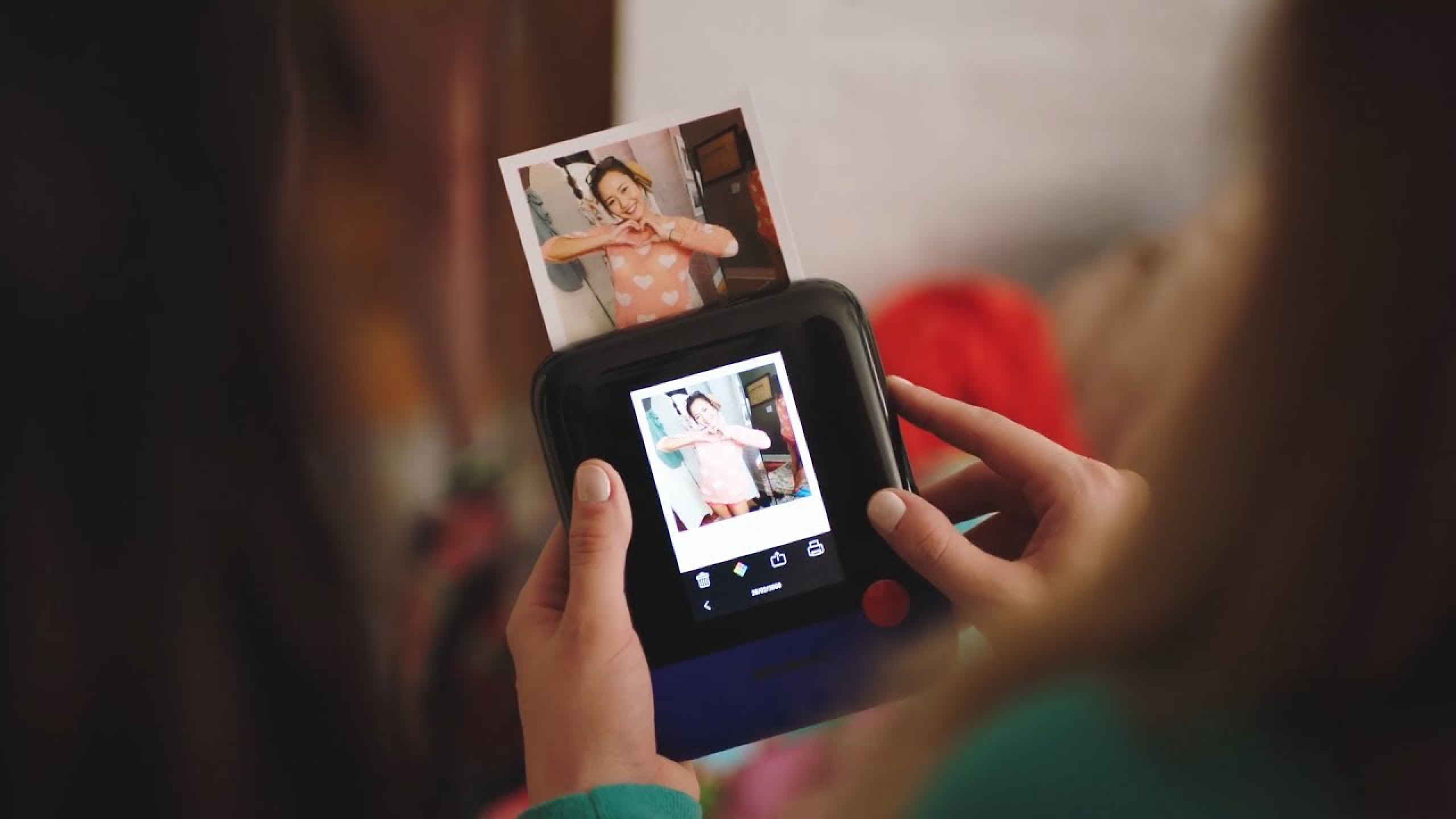
With the UX/UI prototyped, we ideated a variety of features that helped users get more out of their photos — like the ability to write and sketch directly on Polaroids, or a collection of themed stickers.

Polaroid For A New Generation
Launched at CES in 2017, the Polaroid POP was a welcome addition to the beloved brand’s revamped product line on the 80th anniversary of its launch.
