- Packaging Design
- Product Visualization
- Art Direction
Unboxing it All
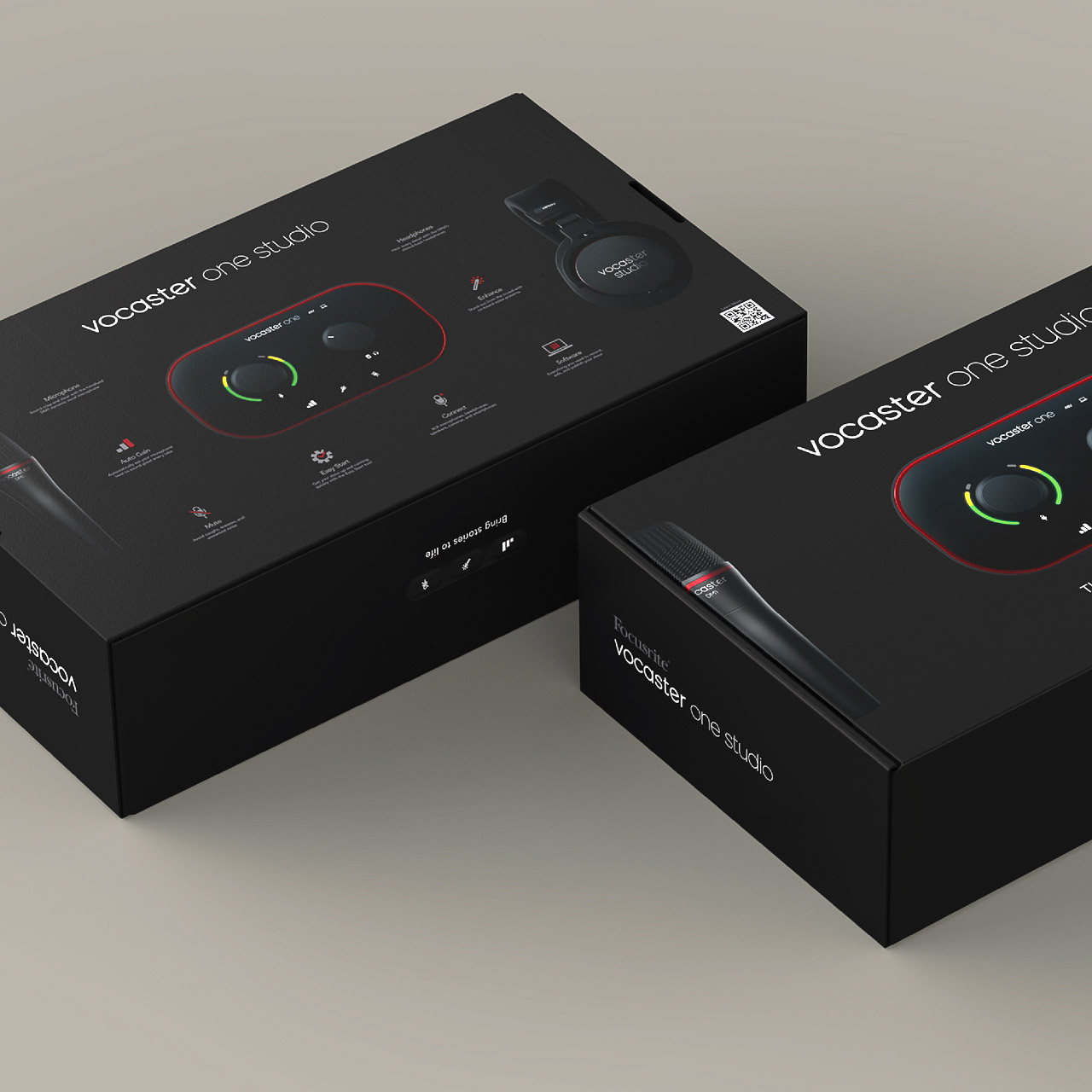
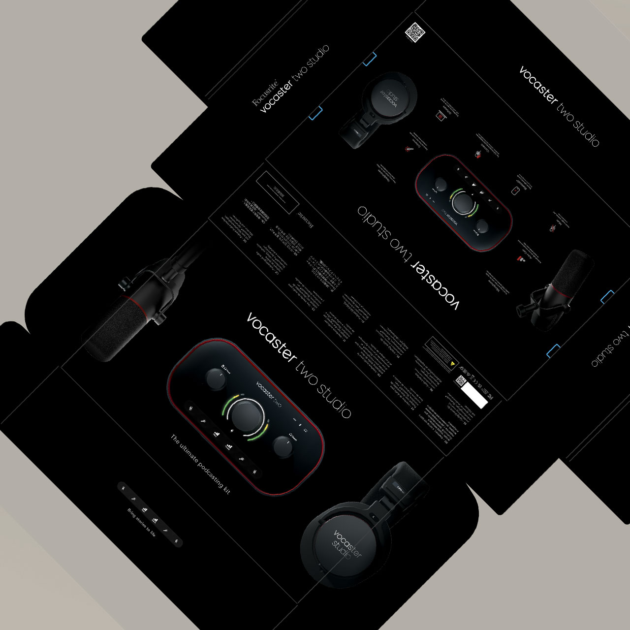
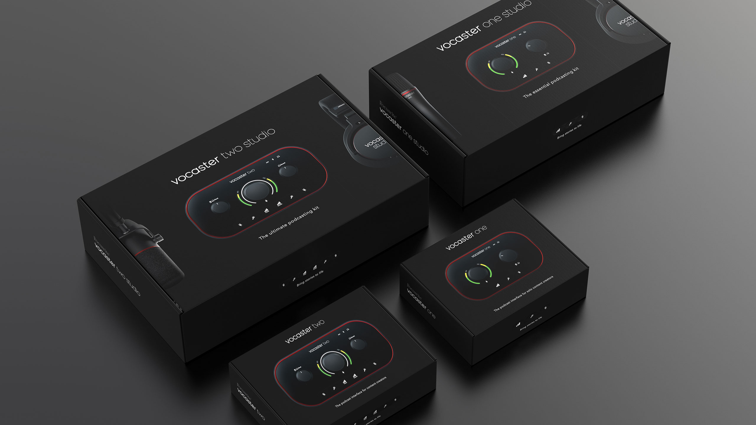
Focusrite came to us to help them launch a brand new product line that needed coexist alongside its current audio interface products on the market. The packaging needed to be slick to match the quality level Focusrite is known for but also be intuitive, simple, and approachable. No heavy handed tech jargon, just features laid out simply for the consumer to understand. We started with multiple concepts before narrowing things down to a product focused design featuring product renders from our team.
Consistent packaging for Focusrite’s new podcasting interface
Keep it Simple
Throughout the concept phase we experimented with different designs all while trying to maintain a simple to use product look and feel. We even created a series of icons that represented many of the popular types of podcasts as a way of showcasing the many potential use cases the product had. Ultimately we landed on a sophisticated black design that gave the product a premium sound feel.


All Aboard!
An important task of the box design was to redesign the onboarding process in a way that was visible to the consumer during the unboxing. The process needed to look as simple and clear as possible with the option to resort to an online help site with more information if needed. Due to wanting to minimize access packaging we created a simple onboarding guide that can be found underneath the boxes lid upon opening.

Turn it up
Vocaster has launched with great success and the team at Focusrite could not be happier. The great relationship established working on the Vocaster packaging is hopefully just the beginning of our work together.
